

In our recent release, we focused on two areas that have a direct impact on how field officers and back-office users work every day: the mobile task list and the navigation inside tasks. Both screens are used constantly in loan origination, follow-ups, and customer verification, so improvements here translate quickly into smoother workflows and fewer delays.
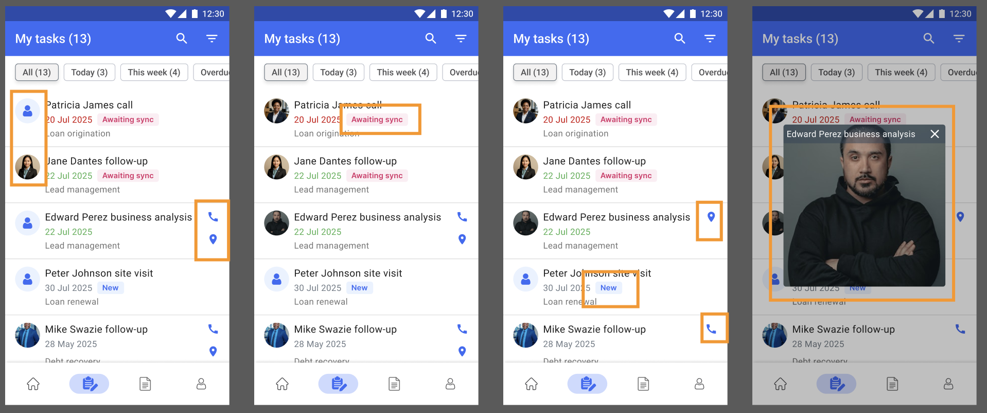
Creating a productive field workflow starts with the task list. It is the screen officers open most often, and even small improvements can have a noticeable impact on daily operations. This update makes key client information available at a glance, reducing the need to open each task individually.
Previously, the task list displayed only basic details such as the task name, due date, and process. Officers had to tap into a task to see who the client was, whether the task was new or awaiting sync, or where the client was located. This added extra steps and made it harder to prioritise visits, plan a route, or follow up at the right time.
The new design brings essential context directly into the list. Each task can now show the client’s photo, phone and location icons, and clear status badges such as New or Awaiting sync. Tasks that still need synchronisation are immediately visible, which is crucial in low-connectivity environments. The due date is also more prominent to make urgent tasks easier to identify.
These additions allow officers to take action without leaving the list. A single tap can place a call, open the client’s location in the native maps app, or preview the photo for quick identification. Over a full day of client visits, these small interactions add up to meaningful time savings, especially in processes that involve frequent, short interactions.
For institutions, this leads to better data accuracy and operational efficiency. Officers move faster, supervisors receive updates more reliably, and fewer tasks are delayed because of sync issues or missing context. By surfacing the most relevant details upfront, the updated task list creates a clearer and more reliable starting point for fieldwork.
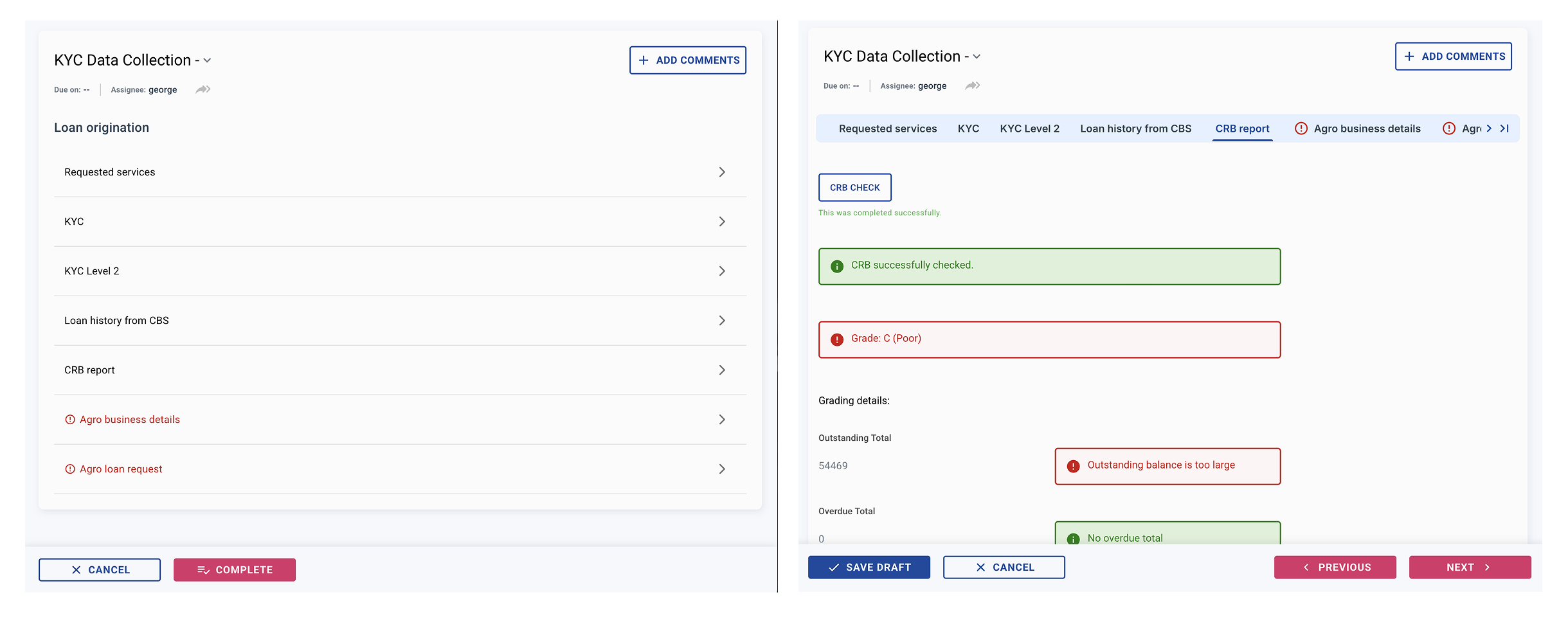
We also redesigned the navigation inside tasks to reduce extra clicks and give users a clearer view of their progress. Previously, moving between sections required returning to the section overview every time. This worked but slowed down multi-step processes such as KYC, CRB checks, or product-specific data collection.
The new navigation allows users to move through a task more naturally while staying inside the current context. Two elements now support this:
Together, these elements create a much clearer mental map of the task structure. This is particularly helpful in longer workflows with multiple verification steps or when switching between client-facing and back-office tasks.
A fixed bottom bar standardises the main actions across all devices. Save Draft, Cancel, and Complete remain available and in the same position on every screen. An additional “Open in New Tab” option makes it easier for back-office users to review or compare information across different sections.
These improvements do not change how tasks function, but they significantly reduce friction in everyday use. With fewer steps, clearer structure, and faster transitions, users can complete tasks more quickly and with fewer errors. For organisations processing high volumes of applications, these gains accumulate into meaningful operational savings.
Both updates share the same goal: reducing friction in the areas users interact with the most. The enriched task list gives officers a clearer overview before they start their day, and the improved navigation helps them move through tasks with less effort. Together, they make the mobile and web experience more intuitive, faster to learn, and easier to use in demanding field environments.